Friday, 15 October 2021


FUEL POVERTY: THE IMPACT OF RISING FUEL PRICES IN THE UK

Jonathan Bradshaw and Antonia Keung

University of York

13 October 2021

Background

Fuel poverty emerged from poverty as a separate notion during the oil crisis of the late 1970s when energy prices rose very rapidly.[1] Basically, the drivers of fuel poverty are rising prices which have risen faster than general inflation, low income, and the poor thermal efficiency of the UK housing stock. Households with high energy costs living in poverty or on its margins face extra costs to keep warm, above those for typical households with much higher incomes. These costs are largely outside the control of those households – given the capital investment that would be required to reduce them – except through trading off the temperatures at which they live against other necessities, exacerbating the difficulties faced by all on such low incomes.

Policy on fuel poverty, and on energy efficiency, which is one of the key methods for alleviating fuel poverty, can have effects on a number of additional policy areas. For example, cold homes can have negative impacts on both mental and physical health, potentially adding to demand on the NHS and social care providers, and directly contributing towards excess winter deaths. Health impacts of cold homes include increased risk of heart attack or stroke, respiratory illnesses, poor diet due to “heat or eat” choices, mental health issues, and worsening or/slow recovery from existing conditions.[2] Those most at risk of ill health from fuel poverty include children, the elderly, and long-term sick and disabled people. It has been estimated that insulating homes to the highest standard could reduce NHS costs by roughly £1.4 billion each year in England alone.[3] The health service is estimated to save £0.42 for every £1 spent on retrofitting fuel poor homes.[4]

Definitions of fuel poverty

Traditionally a household was said to be in fuel poverty if it needs to spend more than 10% of its income on fuel to maintain a satisfactory heating regime (usually 21 degrees for the main living area, and 18 degrees for other occupied rooms). The Expenditure and Food Survey can tell us which households spend more than 10 per cent of their net income (after tax and national insurance contributions) on fuel. Using the 2005/6 survey we found[5] that average weekly expenditure on fuel (in England and Wales) was £14.51 or 4.4 per cent of net income. Then only 7.3 per cent of households were spending more than 10 per cent of their net income on fuel.


Then the definition of fuel poverty became much more complicated. In his government review of fuel poverty[6], John Hills pointed out that we should also take into account the thermal efficiency of the housing that people lived in and recommended a measure based on low income and high costs. He proposed that fuel poverty existed if the household required fuel costs that are above the median level; and were they to spend that amount they would be left with a residual income below the poverty line. The latest proposal from the previous government[7] was to broaden this measure to capture all low-income households living in homes with inherently inefficient energy use. So, the focus of fuel poverty is becoming much less on income and more on inefficient energy use. The government now employs the English Housing Survey (EHS) to assess fuel poverty.

Using the Hills definition and applied to the 2018 EHS the Resolution Foundation[8] found 21% households on income related benefits and 9% not on income related benefits were in fuel poverty.

Estimating fuel poverty

We have reverted to the original 10% measure to produce estimates of the impact of rising fuel prices on fuel poverty using the Living Costs and Food Survey (LCFS) 2019/20[9]. After removing cases with nil expenditure on fuel, light and power the mean weekly energy expenditure is £24.75, median is £21.39 (equivalised £16.25 mean and £13.85 median). In 2019-2020, 9.4% of valid households in the UK are living in fuel poverty. This proportion varied from 21.1% in Northern Ireland and 13.1% in Scotland to 5.4% in the Eastern region. Fuel poverty was higher for LA tenants 22.7% and Housing Association tenants 17.6%  and for lone parents with two or more children 28.1% and single pensioners 35.7%. Fuel poverty is concentrated in the lowest decile of the equivalised income distribution with 37.4% of households in fuel poverty. While only 2.6% of households not in income poverty are in fuel poverty, 38.4% pf those in income poverty are also in fuel poverty.

We do not know how much energy prices are going to rise, not least because they are determined by the price cap which is due to be reviewed but the BBC[10] have suggested that it might be 12%. We have assumed a hike in fuel prices of 15%. This would increase fuel poverty from 9.4% to 12.5% of households. If the fuel price hike is 10%, 20%, 25% or 30% the fuel poverty rates would be  11.4%, 13.3%, 14.4% and 15.6% respectively.[11] If fuel prices rise by 15% the proportion also in income poverty would increase from 38.4% to 46.8%.

£20 per week cut in Universal Credit

That analysis was based on 2019/20 data before the £20 increase in UC. If the UC top-up had been maintained the fuel price hike would have had much less impact on fuel poverty – reducing it from 12.5% to 5.6% or 1.5 million households. Thus, as a result of the UC cut fule poverty is doubles from what it would have been: that is around 3.4m households with 6.3m people.  46.8% of UK households in income poverty (i.e. 2.5 m households with 4.7m people) would now also be at risk of facing fuel poverty. Thus half of poor households in the UK will be doubly poor – income poor and fuel poor


[1] Bradshaw, J.R. and Harris, T. (eds.) (1983). Energy and Social Policy, London: Routledge and Kegan Paul.

[2] Public Health England (2017). Cold Weather Plan for England, making the case; why long-term strategic planning for cold weather is essential to health and wellbeing, p. 24.

[3] All Party Parliamentary Group for Healthy Homes and Buildings (2018). Building our Future: Laying the Foundations for Healthy Homes and Buildings, White Paper

[4] UK Green Building Council (2017) Regeneration and Retrofit Task Group Report.

[5] Bradshaw, J. (2008). “Who is fuel poor?”, Poverty 131, Autumn, pp. 9-11.

[6] Hills, J. (2012). Getting the measure of fuel poverty: Final Report of the Fuel poverty Review.http://eprints.lse.ac.uk/51237/1/__libfile_REPOSITORY_Content_CASE_CASEreports_CASEreport72.pdf

[7] https://assets.publishing.service.gov.uk/government/uploads/system/uploads/attachment_data/file/819606/fuel-poverty-strategy-england-consultation.pdf

[8] Reported in Torsten Bell’s weekly email 24/9/21.

[9] Office for National Statistics. (2021). Living Costs and Food Survey, 2019-2020. [data collection]. UK Data Service. SN: 8803, http://doi.org/10.5255/UKDA-SN-8803-1

[10] https://www.bbc.co.uk/news/business-58090533

[11] As this is based on 2019/20 data it takes no account of either the uplift or cut to Universal Credit.


Thursday, 16 July 2020

COVID-19 DEATHS, DEPRIVATION and ETHNICITY


Jonathan Bradshaw[1], Veronica Dale[2] and Karen Bloor[3]


[1] Professor of Social Policy, Social Policy research Unit, University of York
[2] Research Fellow, Department of Health Sciences, University of York
[3] Professor of Health Economics and Policy, Department of Health Sciences, University of York

PREAMBLE

This paper is a summary of analysis of ONS data undertaken since the pandemic hit the UK in March 2020. It was designed to analyse variations in COVID-19 deaths at the level of small geographical areas and link them to other data on those areas, particularly deprivation and ethnicity. We first present the national picture.

NATIONAL

ONS published the weekly level death statistics on 14 July enabling a comparison of COVID-19 deaths and excess deaths up to week 27 (3 July 2020). Figure 1 summarises this data. Excess deaths are calculated as the difference between all deaths that occurred in that week averaged over the last five years and the actual number of deaths in that week this year. It is thought to be a safer estimate of COVID-19-related deaths because not all deaths, perhaps particularly in the first weeks of pandemic, were recorded as COVID-19- related. The Figure shows the sharp increase in deaths beginning in week 12 around the 20 March. Thankfully there has been a sharp reduction in COVID-19-registered and excess deaths since week 16 around 17 April. It is also interesting that the excess deaths have begun to mirror much more closely the COVID-19 deaths. 
  

COVID-19 DEATHS, DEPRIVATION and ETHNICITY

ONS itself has published many interesting analyses of COVID-19 deaths, which have shown higher numbers of deaths by the level of area deprivation, and higher levels of deaths among BAME people.[1] [2] [3] Platt and Warwick[4]  found that some ethnic groups have higher rates of COVID-19 mortality even though on the basis of their age they should have lower death rates. After accounting for the effects of age and geography the Black Caribbean group have deaths three times higher than the White British. There has been one ONS study that has linked death certificates mentioning COVID-19 with Census data on age, sex, ethnicity, other demographic characteristics and socio-economic status including the Index of Deprivation decile. They found that males and females of Black ethnicity were 1.9 times more likely to die than those of White ethnicity and men of Bangladeshi and Pakistani origin were 1.8 times and females 1.6 times more likely to die than those of White ethnicity.[5] However the analysis was undertaken at local authority level.

The figure below, based on the latest ONS deaths data for England published by ONS on 12 May, indicate that the age standardised death rates from COVID-19 are more than twice as high in the most deprived deciles as they are in the least. But there is very little difference in COVID-19 deaths as a proportion of all deaths by deprivation.

Figure 2. Age standardised Covid deaths in England by IMD decile.[9]
AT LOCAL AUTHORITY LEVEL

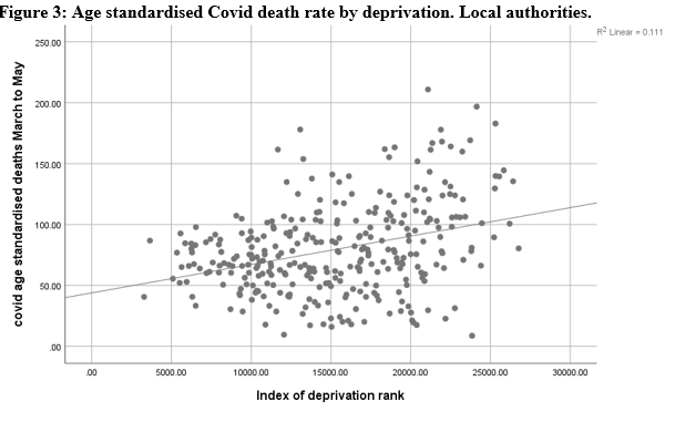
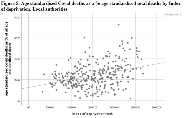
Meanwhile, ONS published new data by Local Authority, which we have analysed to explore variations in deaths by deprivation and ethnicity.[1]

Method

We created a new data set by merging the ONS data on all deaths and COVID-19 deaths up to the end of May with Index of Deprivation data by local authority and estimates of the ethnic mix of the population produced by ONS in 2016. We produced two dependent variables: the age-standardised death rate due to COVID-19 and the age-standardised deaths from COVID-19 as percentage of all age-standardised deaths.

Results

Firstly, we show the bivariate relationship between our two dependent variables and deprivation and BAME in the following scatterplots. It can be seen that for both dependent variables there is a stronger association with BAME than there is with deprivation.


[1] ONS Number of deaths and age-standardised rates, by sex, Local Authorities in England and Wales, deaths occurring between March and May 2020


Then in the tables below we present the results of two regressions with our dependent variables.

In Table 1 the higher the % BAME the more COVID-19 deaths as % of the population. The index of deprivation rank makes little contribution and the more deprived the LA the lower the deaths.  Using age-standardised COVID-19 deaths as a percentage of all age-standardised deaths as our dependent variable, the ID rank is significant and negative – the more deprived an area the higher the COVID-19 deaths after controlling for BAME.


Table 1: Regression of age-standardised COVID-19 deaths by ID and BAME, local authority level
Age-standardised COVID-19 death rate
Age-standardised COVID-19 deaths as a percentage of all age-standardised deaths
β
β
Index of deprivation rank
0.104 (p=0.015)
0.132 (p=0.004)
Percentage of the population who are BAME
0.673 (p<0.001)
0.621 (p<0.001)

R-squared
0.51
0.46


We repeated this analysis to check whether there was a London effect independent of ethnicity and deprivation. We found that once a London dummy had been introduced the age-standardised COVID-19 death rate was still almost entirely explained by ethnicity, London was not significant; for age-standardised COVID-19 deaths as a % of all age-standardised deaths London was a significant factor but the main explanatory factor was still ethnicity.

The problem with this analysis is that local authorities are really too large spatial entities to analyse the impact of ethnicity and deprivation where variation within the area may be higher than variation between the area. So, we repeat the analysis at smaller area level.

 AT SMALL AREA LEVEL

We also attempt to analyse COVID-19 deaths by deprivation and ethnicity at small area level. One other justification for making an attempt to analyse COVID-19 deaths at small area level is that although it is analysis at spatial rather than individual level, there are doubts about the accuracy of ethnic group registration in hospital episodes statistics.

Method

The measure of deprivation used is the Index of Deprivation (IMD) 2019. This is derived from the weighted average of seven domains of deprivation:  income, employment, education, health, crime, barriers (to housing and services) and living environment. Each of these is the product themselves of a number of indicators. The ID domains are first derived for 32,844 Lower-layer Super Output areas (LSOA). The ONS has combined deaths from COVID-19 and other causes into Middle Level Super Output Areas (MSOA) with an average population of 8243 in England - on the grounds that the number of deaths is too low to analyse at the LSOA level.

We extracted the ranks for the Index of Deprivation by LSOA and summarised them into MSOAs using the ONS look-up tables. The lower the rank the more deprived.

We then added one other indicator to the data set: the % of the population who are Black, Asian, Mixed ethnic group (BAME) all at MSOA level -  all derived by ONS from 2011 census data.[1] This means that these data are not up to date.

We use two dependent variables: COVID-19 deaths as a percentage of all deaths March to May in each MSOA;  COVID-19 deaths per 1000 of the population in each MSOA. The latter standardises the results to control for variation in the populations sizes of MSOAs (which are quite large – ranging from 2,242-24,969. These are for the period from the beginning of March to the end of May published by ONS on 12 June 2020.[2] It proved impossible to age-standardise the death rates at MSOA level because there are too few cases. So, in the regressions we include age covariates to see the effect of IMD and ethnicity, after controlling for age. After looking at the death rates by age group we used six groups, under 40, 40-59, 50-59, 60-69, 70-79 and 80+. So, we include the number in the  population of each MSOA for each of those age groups. We are not interested in the estimates of these parameters, just the fact they control for the age structure of each MSOA population.

Results

Bivariate associations are summarised in Table 2, showing that the lower the IMD, that is the more deprived the area, the higher the COVID-19 deaths, and the higher the proportion of BAME the higher the deaths. The associations are stronger for BAME than for the IMD.

 Table 2: Correlation matrix
Correlations

Proportion of all deaths which are COVID
Covid deaths per 1000 of the population
% BAME
IMDrank
Proportion of all deaths which are COVID-19
Pearson Correlation
1
.699**
.424**
-.113**
Sig. (2-tailed)

<0.001
<0.001
<0.001
N
6791
6791
6791
6791
COVID-19 deaths per 1000 of the population
Pearson Correlation
0.699**
1
0.094**
-0.060**
Sig. (2-tailed)
<0.001

<0.001
<0.001
N
6791
6791
6791
6791
% BAME
Pearson Correlation
0.424**
0.094**
1
-0.342**
Sig. (2-tailed)
<0.001
<0.001

<0.001
N
6791
6791
6791
6791
IMD rank
Pearson Correlation
-0.113**
-0.060**
-0.342**
1
Sig. (2-tailed)
<0.001
<0.001
<0.001

N
6791
6791
6791
6791
**. Correlation is significant at the 0.01 level (2-tailed).

As before, we summarise the results in the form of simple regressions for each dependant variable.

Table 3 column 1-2 shows the regression of COVID-19 deaths as a % of all deaths. Here BAME contributes much more to the variation than IMD. Indeed, the latter is not significant. As there is some risk of collinearity in that BAME and IMD are weakly correlated (r=-0.342) we introduce an interaction variable. Columns 3-4 include an interaction effects, with the same findings. This model explains 20.5% of the variation.


COVID-19 deaths as a % of all deaths including IMD and % BAME adjusted for age
COVID-19 deaths as a % of all deaths including IMD and % BAME adjusted for age with BAME and IMD interaction
COVID-19 deaths per 1000 of the population including IMD rank and % BAME
COVID-19 deaths per 1000 of the population including IMD rank and % BAME and interaction

 Î²
 p
 Î²
 p
 Î²
 p
 Î²
 p
Age_Under40
-0.132
<0.001
-0.135
<0.001
-0.229
<0.001
-0.23
<0.001
Age40_49
0.087
<0.001
0.08
0.001
0.024
0.365
0.02
0.457
Age50_59
0.167
<0.001
0.175
<0.001
0.126
<0.001
0.131
<0.001
Age60_69
-0.216
<0.001
-0.241
<0.001
-0.142
<0.001
-0.157
<0.001
Age70_79
-0.098
0.013
-0.044
0.271
-0.342
<0.001
-0.311
<0.001
Age_80plus
0.064
0.005
0.048
0.035
0.534
<0.001
0.524
<0.001
IMD rank
0.018
0.178
-0.055
0.001
-0.135
<0.001
-0.176
<0.001
% BAME
0.393
<0.001
0.262
<0.001
0.166
<0.001
0.092
<0.001
Interaction between IMD and % BAME
0.164
<0.001


0.093
<0.001


Columns 5-6 show the results for COVID-19 deaths per 1000 of the population in each MSOA. Again, BAME has a slightly stronger effect than IMD rank. The proportion of variation explained by this model is 10.9%. When the interaction effect is added in Columns 7-8, the IMD becomes a more important determinant than BAME of variation in COVID-19 deaths per 1000.

Discussion

The overall impression from this analysis is that ethnicity and deprivation both contribute to increasing the chances of dying of COVID-19, but ethnicity explains more variation than IMD on most models.

This is, frankly, quite a surprise – especially given the clear association between deprivation and health inequalities. It is beyond the scope of this paper to explain it, but there a number of possibilities discussed by other research teams, for example see an summary here. All this needs further research.